By default, trims 1 percent of the outliers in height data
Arguments
- x
AFMdata object
- no
channel number of the image
- mpt
midpoint for coloring
- graphType
1 = graph with legend outside, 2 = square graph with line bar, 3 = plain graph, 4 = plain graph with scale, 5 = legend only
- trimPeaks
value from 0 to 1, where 0=trim 0% and 1=trim 100% of data points, generally a value less than 0.01 is useful to elevate the contrast of the image
- fillOption
can be one of 8 color palettes, use "A" ... "H", see
scale_fill_viridis- addLines
if
TRUElines from obj are added to graph, lines can be added withAFM.lineProfilefor example- redBlue
if
TRUEoutput red / blue color scheme- verbose
if
TRUEit outputs additional information.- quiet
if
TRUEthen no output at all- setRange
vector with two values, such as c(-30,30) to make the scale from -30 to +30
- ...
other arguments, such as col='white' to change color of bar
Value
ggplot graph
See also
Examples
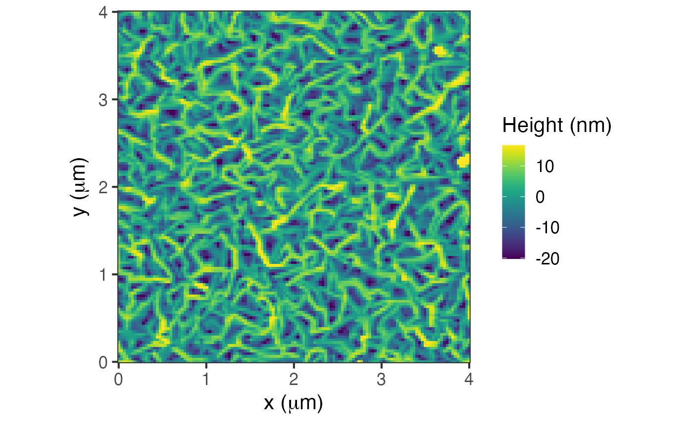
d = AFM.import(AFM.getSampleImages(type='ibw'))
plot(d, graphType=2, quiet=TRUE)
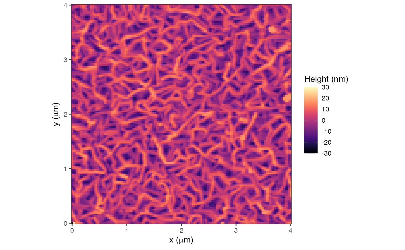
 plot(d, fillOption = "magma", setRange=c(-30,30), quiet=TRUE)
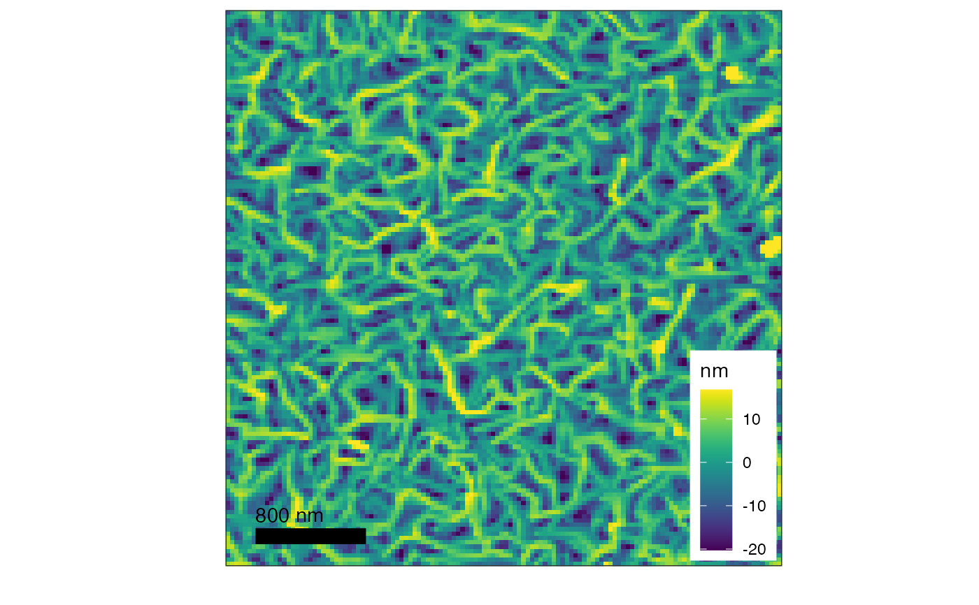
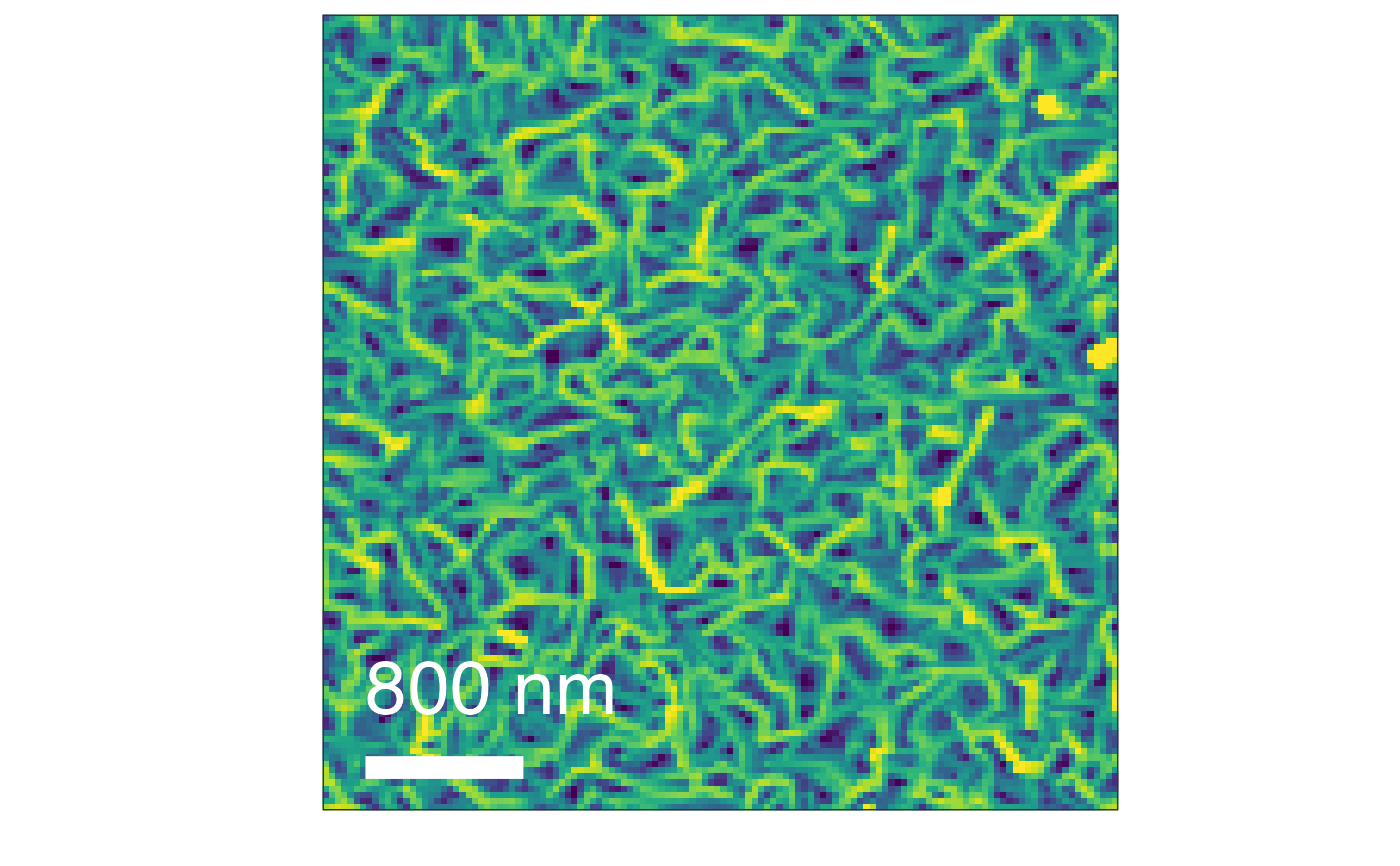
 # size will changes the length scale size
plot(d, graphType=4, col='white', size=10, quiet=TRUE)
# size will changes the length scale size
plot(d, graphType=4, col='white', size=10, quiet=TRUE)
 # increase the size of the labels:
plot(d, quiet=TRUE) + ggplot2::theme_bw(base_size=16)
# increase the size of the labels:
plot(d, quiet=TRUE) + ggplot2::theme_bw(base_size=16)
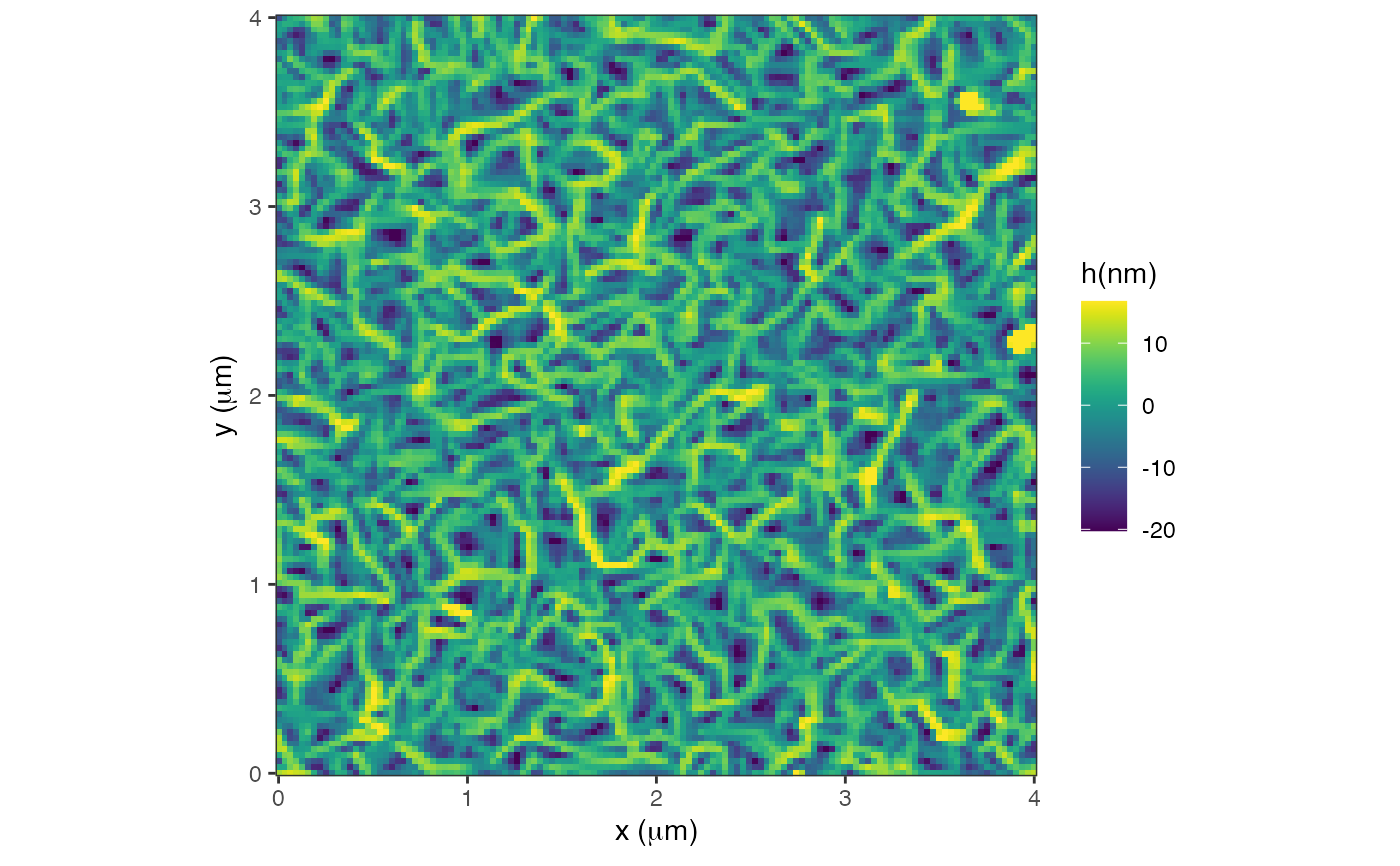
 # change the name of the z-scale
plot(d, quiet=TRUE) + ggplot2::labs(fill = "h(nm)")
# change the name of the z-scale
plot(d, quiet=TRUE) + ggplot2::labs(fill = "h(nm)")